Data-Science Series - Introduction to Orange Tool
- Thakkar Vedang

- Oct 22, 2021
- 2 min read
This blog is all about some basic information about the Orange tool as well as how we can get started with the tool with some basic functionalities provided by the tool.
What is Orange Tool?

Orange is an open-source data visualization, machine learning and data mining toolkit. It features a visual programming front-end for explorative rapid qualitative data analysis and interactive data visualization.
Orange tool consists of various items to be used for the machine learning and data science.
Canvas : Provides UI for data analysis.
Widget : Used to use the various items such as data, visualize or any machine learning modal.
Simple Workflow Example

Step-1: Using widgets library select File widget

Now, after double clicking the File, we need to select the dataset, here we have utilized the IRIS dataset.
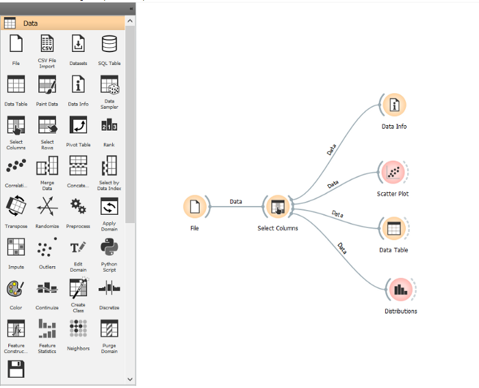
Here you can see that I used the in build Iris data-set provided by Orange. The workflow is such that data from the data-set is sent to the data table, to Distributions for creating a distribution and a Scatter Plot is plotted from the data-set.
To create this workflow we load the data-set using the File widget, and then flow between File-Data Info, File-Data Table, File-Distributions and File-Scatter Plot is created.
For the data to be loaded in the Canvas, select the File widget from the left pane and place it in the canvas. Double click on the File widget and select the iris.tab file.


Step-2: To get the information about the data loaded in the file widget we can create a flow between the File widget and use the Data Info Widget which shows the name, description, row count, column count, features and target values in the data-set in File widget.

Similarly then we establish a flow between File-Data Info, File-Scatter Plot, File-Data Table and File-Distributions. We can design a simple workflow in Orange this manner.

Column Filter
Select Column

Scatter Plot Widget
It is used to plot scatter graph between desire features. We also change X-axis and Y-axis values, we also directly get informative projections and also plot in color regions


Data Distribution
Use the Data Distribution widget to get the graphical representation of the data-set values. Here I got the distribution for various features from data-set.

You can observe that for the feature like petal width the data is not clearly distributed for the target variable category, but on selecting filter based on the sepal width the data is distributed properly to three different categories.
We can also click on Find Informative Projections which will give us best projections we can have automatically.

Here we have used Iris Data-set provided by the Orange Tool but You can upload your data from API in Orange Tool.
To load your data in Orange select the File Widget and from there in you can either select the data-set provided by Orange or else browse to the data-set file in your local machine to load the data.
If you want to load external data use can select the URL option in the File widget, where one can paste the external data-set link to load the data.


Comments